INITIALIZING . .

WORK
WORK
WORK
WORK
OTHER
OTHER
OTHER
OTHER
WORK
WORK
WORK
WORK
OTHER
OTHER
OTHER
OTHER
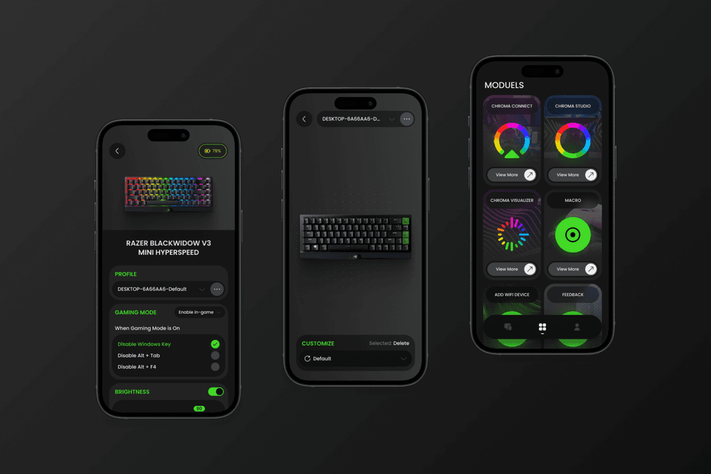
Wechat Redesign
A modern reinterpretation of WeChat’s interface with a dark theme, designed for improved usability, visual clarity, and a more immersive user experience.


BRAND-
TYPE-
Mobile App
CATEGORY-
UI/UX Design
THE DESIGN
This WeChat redesign concept adopts a sleek and modern dark theme, aiming to enhance visual comfort and highlight key interface elements. The design emphasizes clarity and hierarchy through clean typography, consistent iconography, and controlled spacing. Accent colors such as green and turquoise are used strategically to highlight interactions and call-to-actions, creating a visually engaging yet unobtrusive interface. Key features are restructured for easier access, with a focus on usability and intuitive navigation, while maintaining the familiarity of WeChat’s original layout.
TOOLS-
FIGMA-
Created UI and interactive prototype.
FIGMA-
Created UI and interactive prototype.
OTHER WORKS
[
YOU MIGHT BE INTERESTED
]
INITIALIZING . .
WORK
WORK
WORK
WORK
OTHER
OTHER
OTHER
OTHER
WORK
WORK
WORK
WORK
OTHER
OTHER
OTHER
OTHER
Wechat Redesign
A modern reinterpretation of WeChat’s interface with a dark theme, designed for improved usability, visual clarity, and a more immersive user experience.
BRAND-
TYPE-
Mobile App
CATEGORY-
UI/UX Design
THE DESIGN
This WeChat redesign concept adopts a sleek and modern dark theme, aiming to enhance visual comfort and highlight key interface elements. The design emphasizes clarity and hierarchy through clean typography, consistent iconography, and controlled spacing. Accent colors such as green and turquoise are used strategically to highlight interactions and call-to-actions, creating a visually engaging yet unobtrusive interface. Key features are restructured for easier access, with a focus on usability and intuitive navigation, while maintaining the familiarity of WeChat’s original layout.
TOOLS-
FIGMA-
Created UI and interactive prototype.
OTHER
[
YOU MIGHT BE INTERESTED
]